Reborn Coffee Packaging Redesign
Project Scope: Packaging Design,
Brand Development, Creative Direction
Overview: Working from Reborn Coffee’s new logo and evolving brand direction, I
led
the design of packaging and retail print materials across their product line. I balanced a
modern visual direction with classic elements from the previous identity to create
consistency during a period of brand transition.
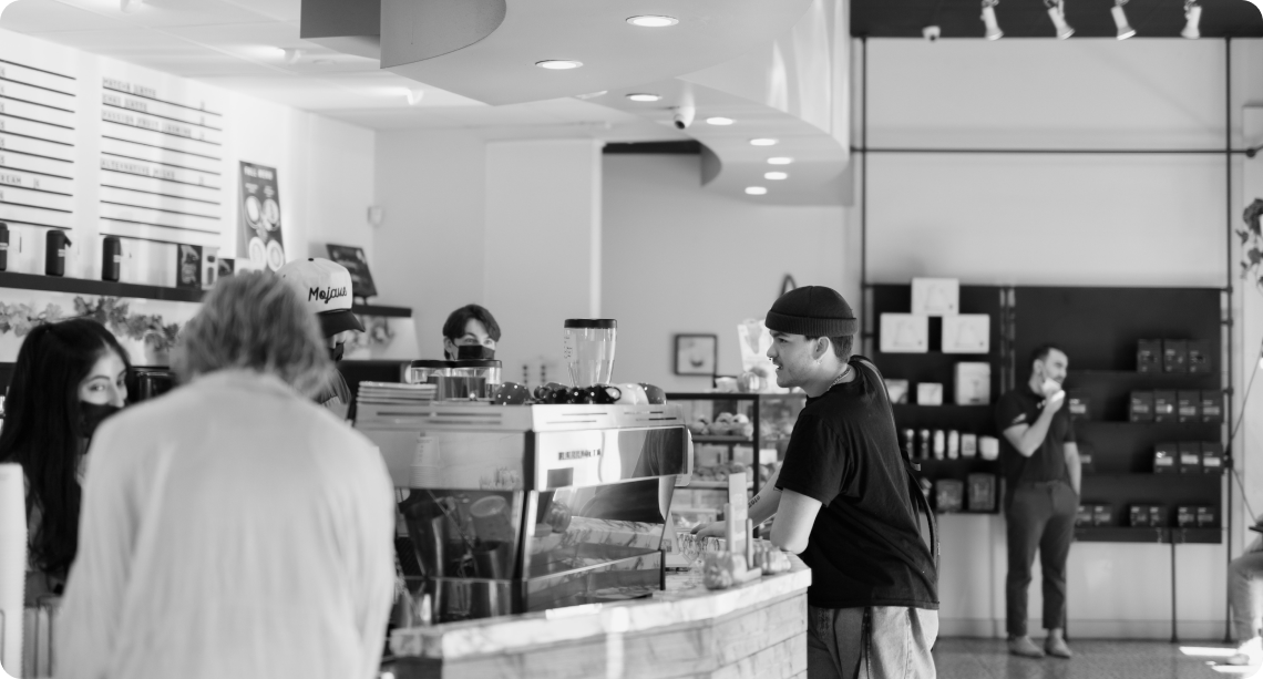
The Challenge
Reborn Coffee was in the midst of a gradual rebrand, introducing a new logo and modern,
minimal aesthetic while much of its stores still reflected the previous identity. Their coffee
bean packaging became the first major customer-facing touchpoint for the new brand,
requiring an elevated look within limited production budgets.
Design Approach
The new logo marked a clear departure from the previous brand aesthetic. To
create a smoother transition, the packaging design intentionally preserved familiar
visual elements, allowing the updated identity to feel cohesive, recognizable, and
aligned with existing in-store presence while remaining flexible for future product
expansion.
OLD LOGO
NEW LOGO
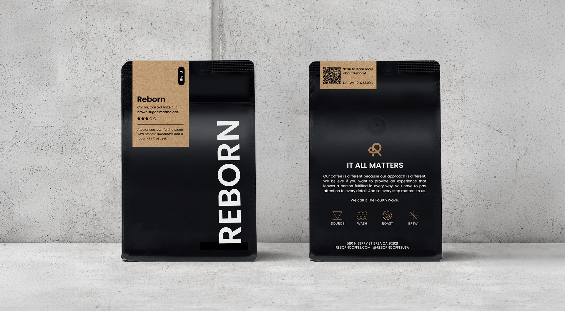
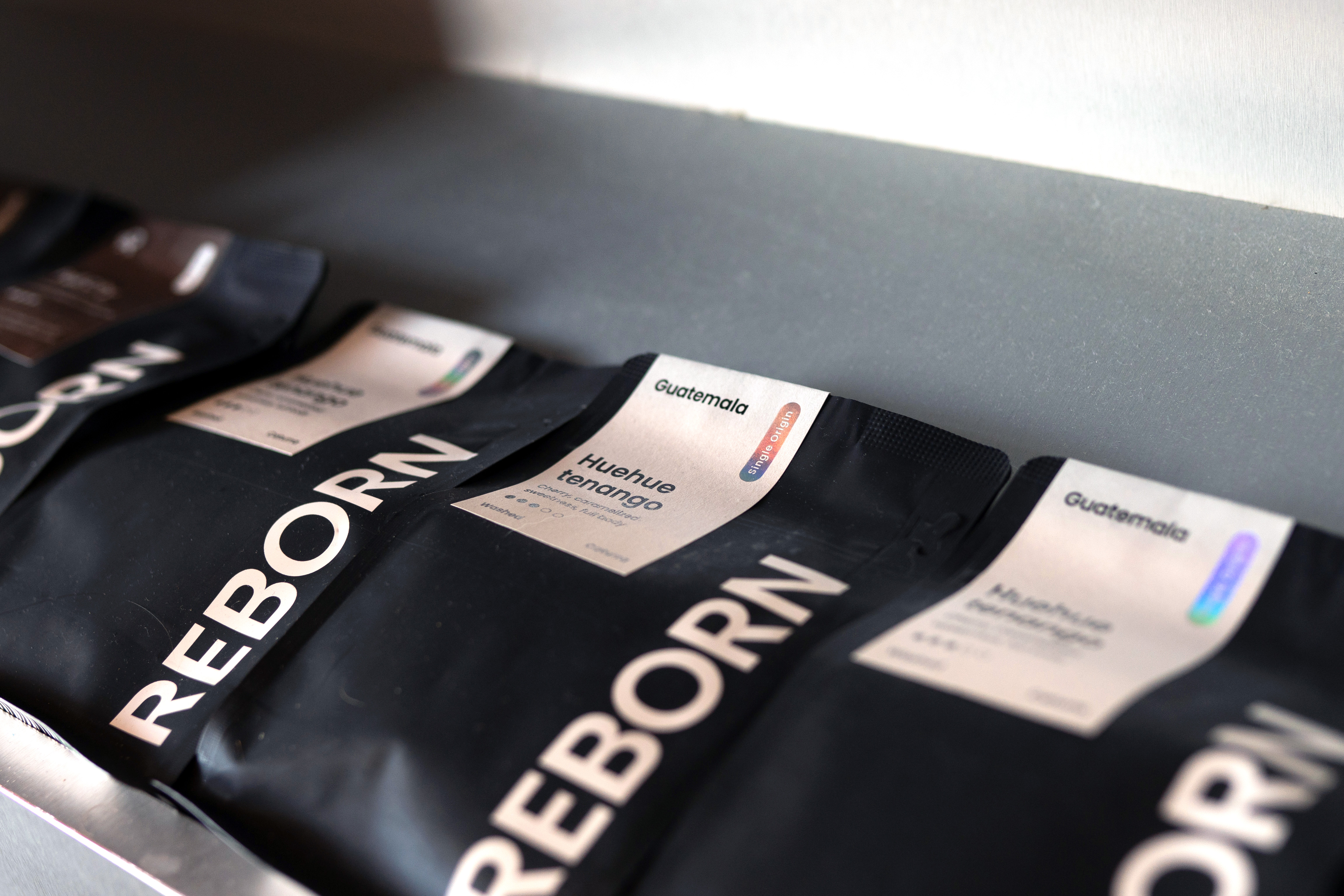
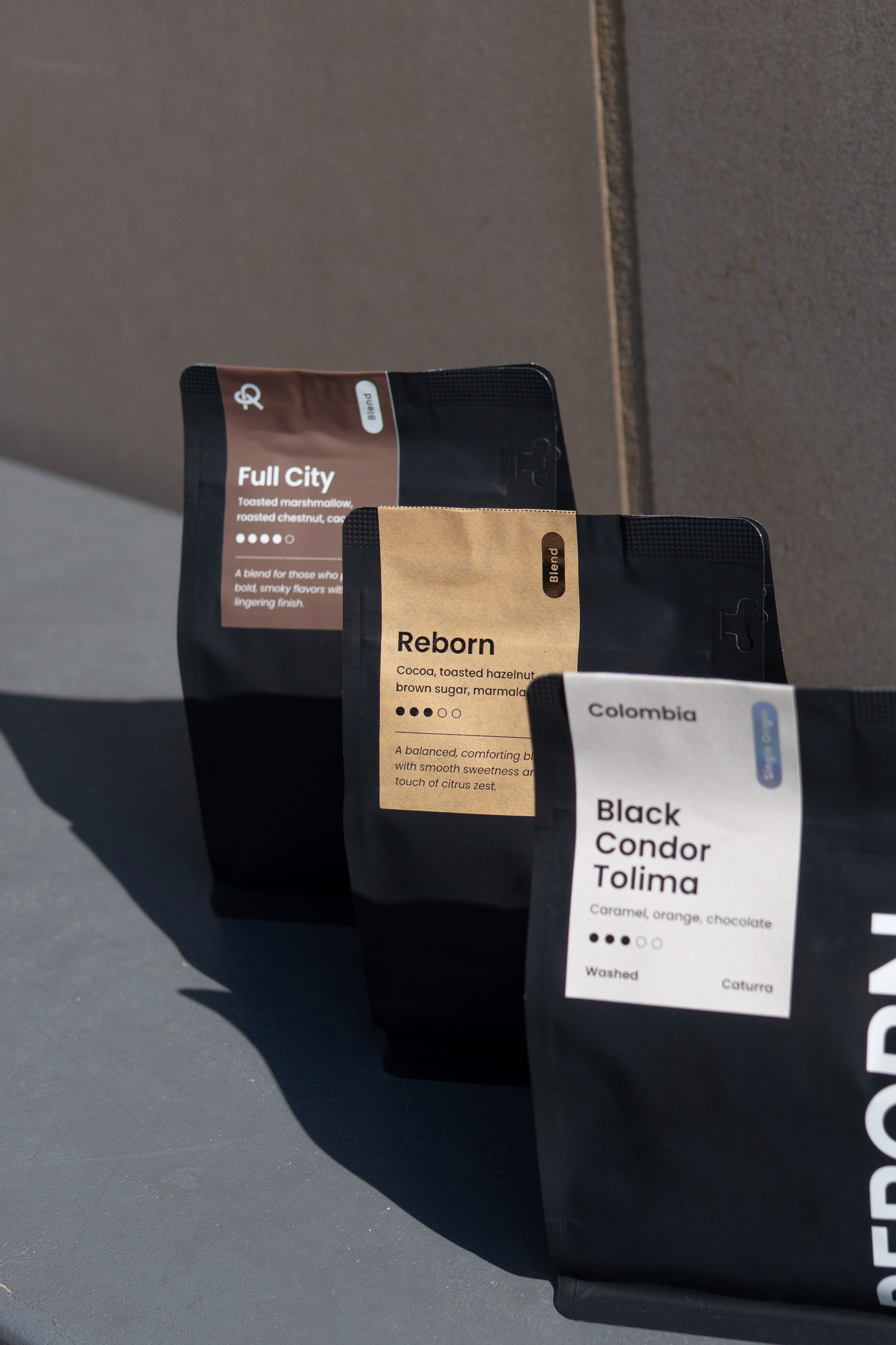
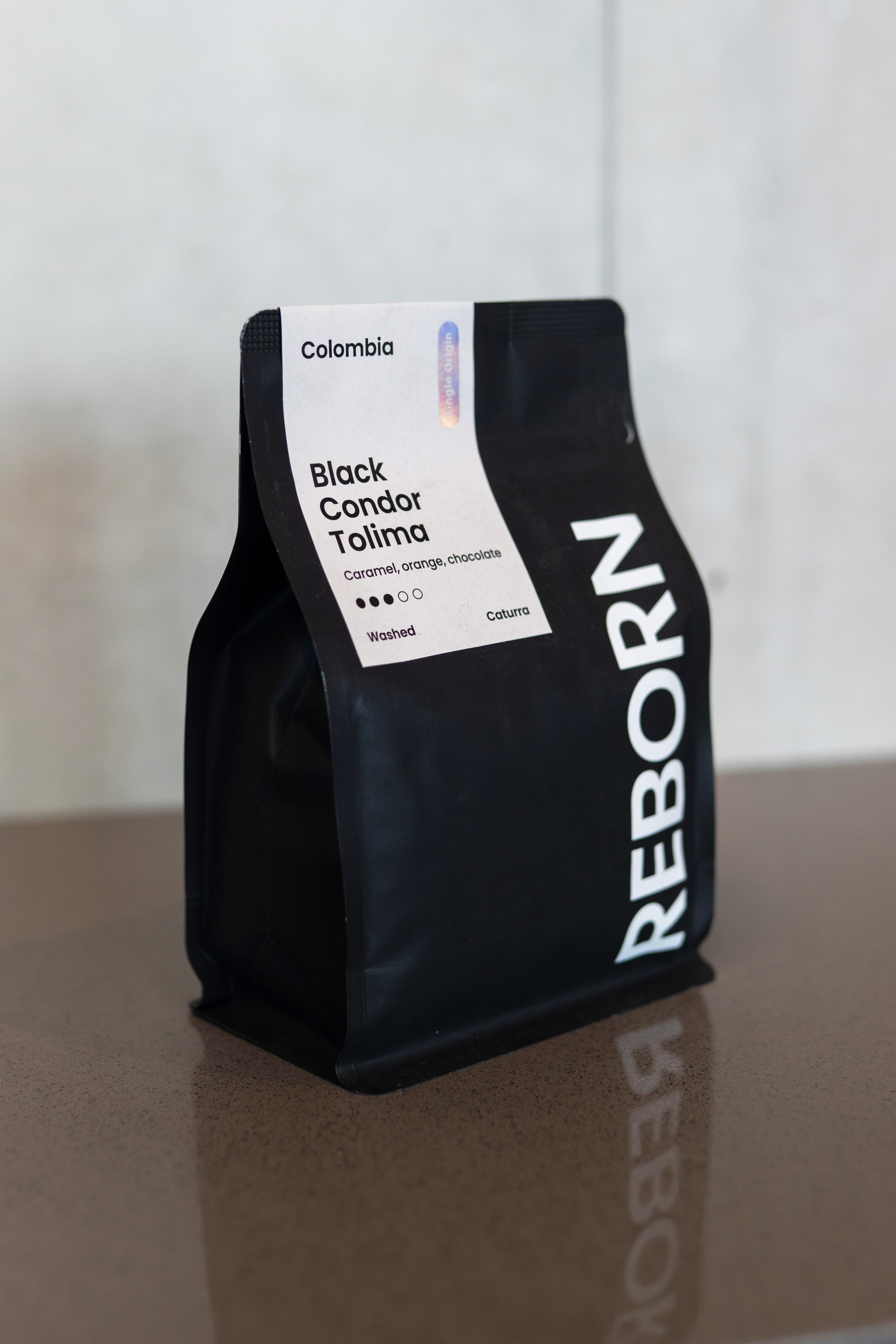
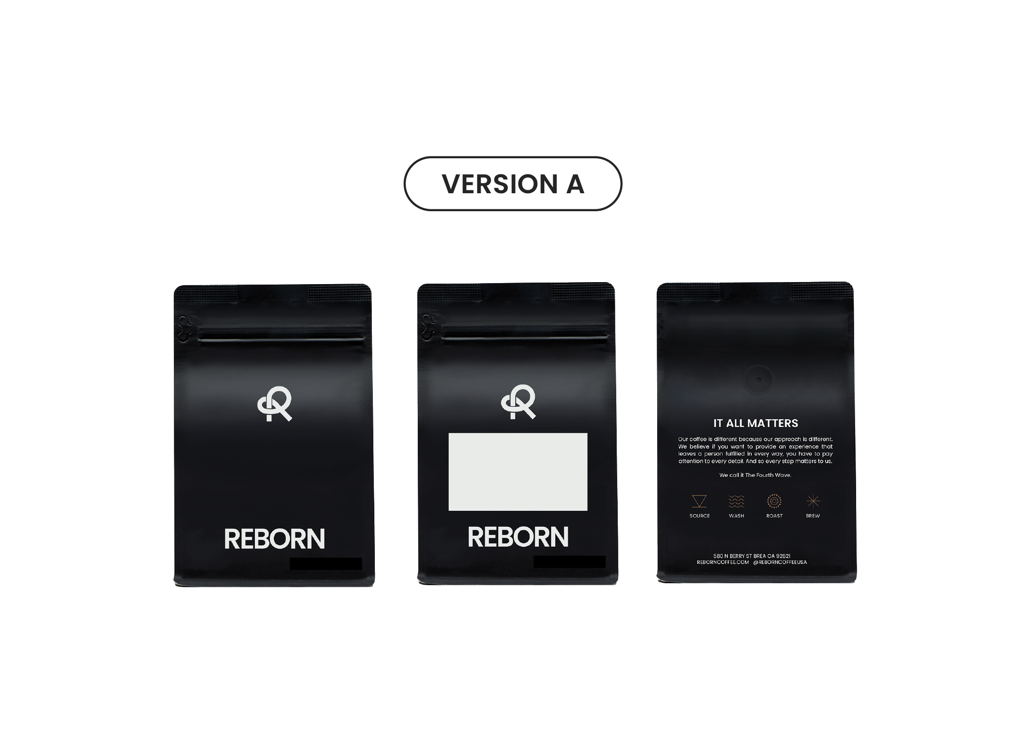
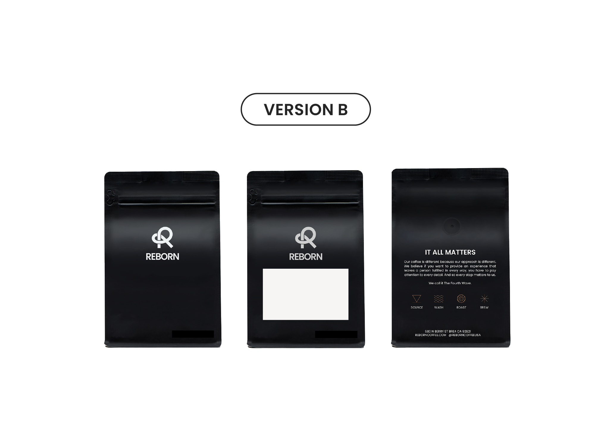
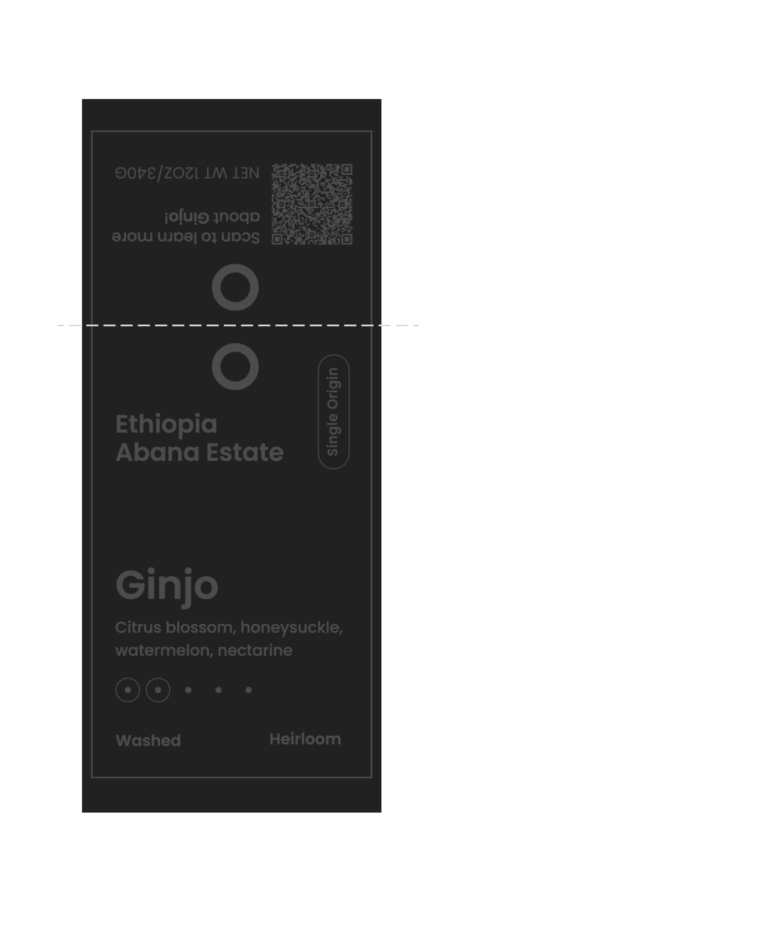
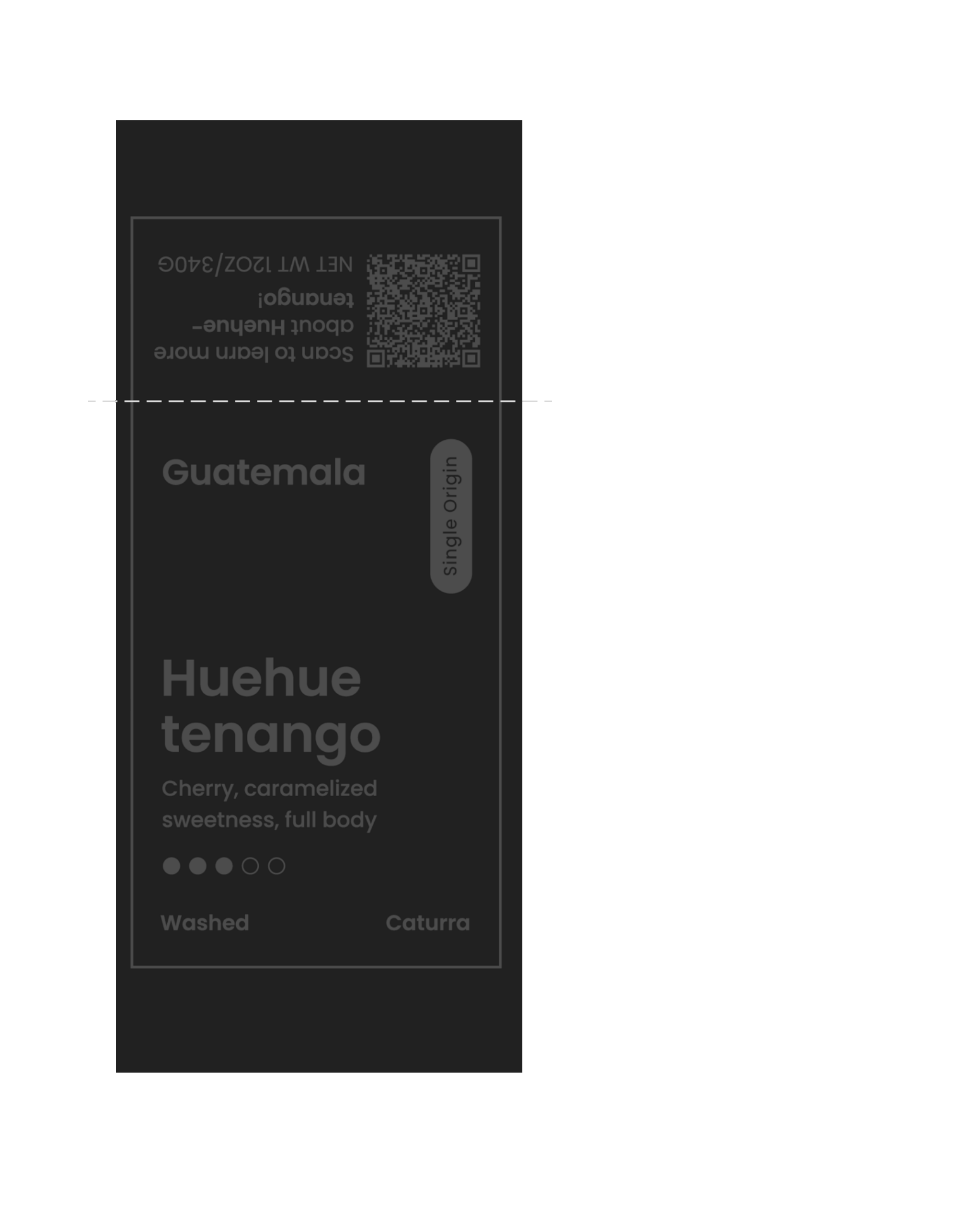
Whole Bean Packaging
Versions A and B featured the new R logo prominently on the front. Because the R logo is
drastically different from the previous logo, it competed with the overall design and
disrupted the clean, sleek aesthetic we were aiming for.
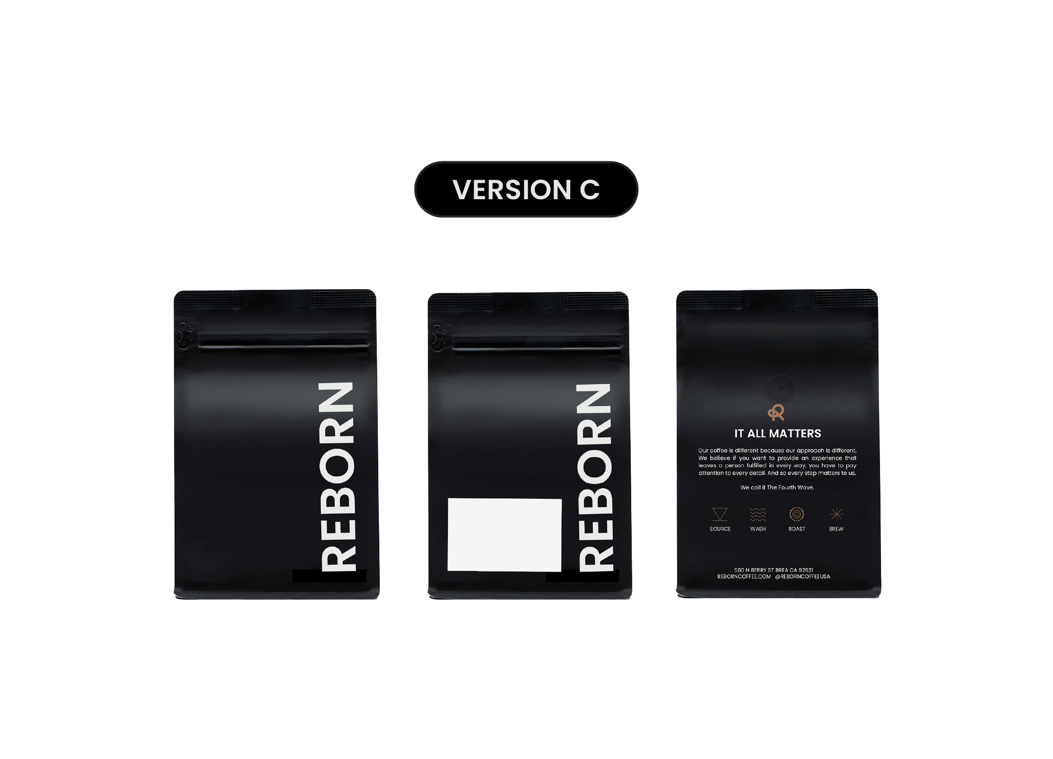
Chosen Direction – Version C
Version C was selected for its clean, bold, and sleek presentation. It aligned the best with
Reborn Coffee’s identity, subtly incorporated the new logo, and ensured the design felt
cohesive without overwhelming the packaging.
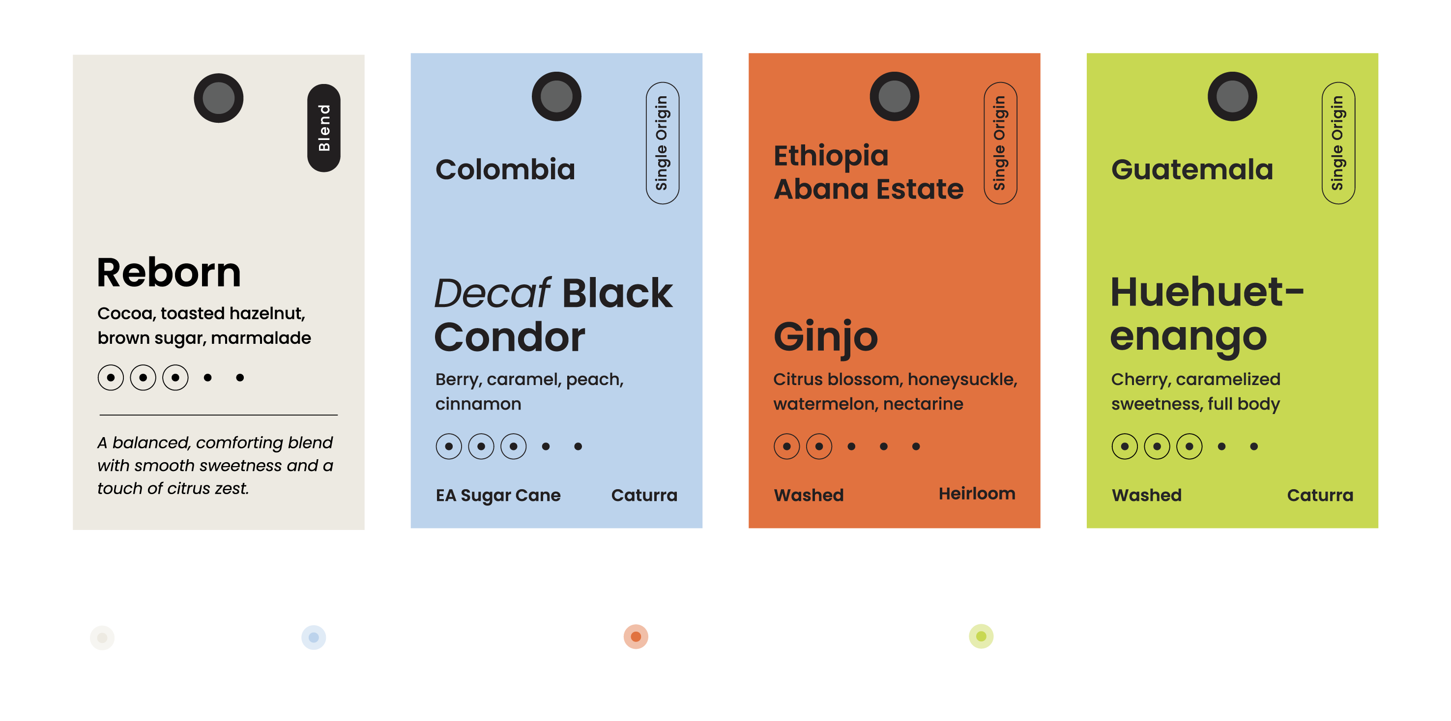
Whole Bean Label
To complement the Version C packaging, I designed a label that reinforces the brand
identity while clearly communicating key information like roast type, flavor notes, and
origin. The typography features bold lettering and playful layouts with foil detailing
on the “pill” to add a premium touch.
Initially, we considered bright colors, but budget constraints led us to neutral, earthy
tones that also evoke a natural, artisanal feel. The label’s placement keeps the front
clean and eye-catching, letting the packaging remain bold and modern.
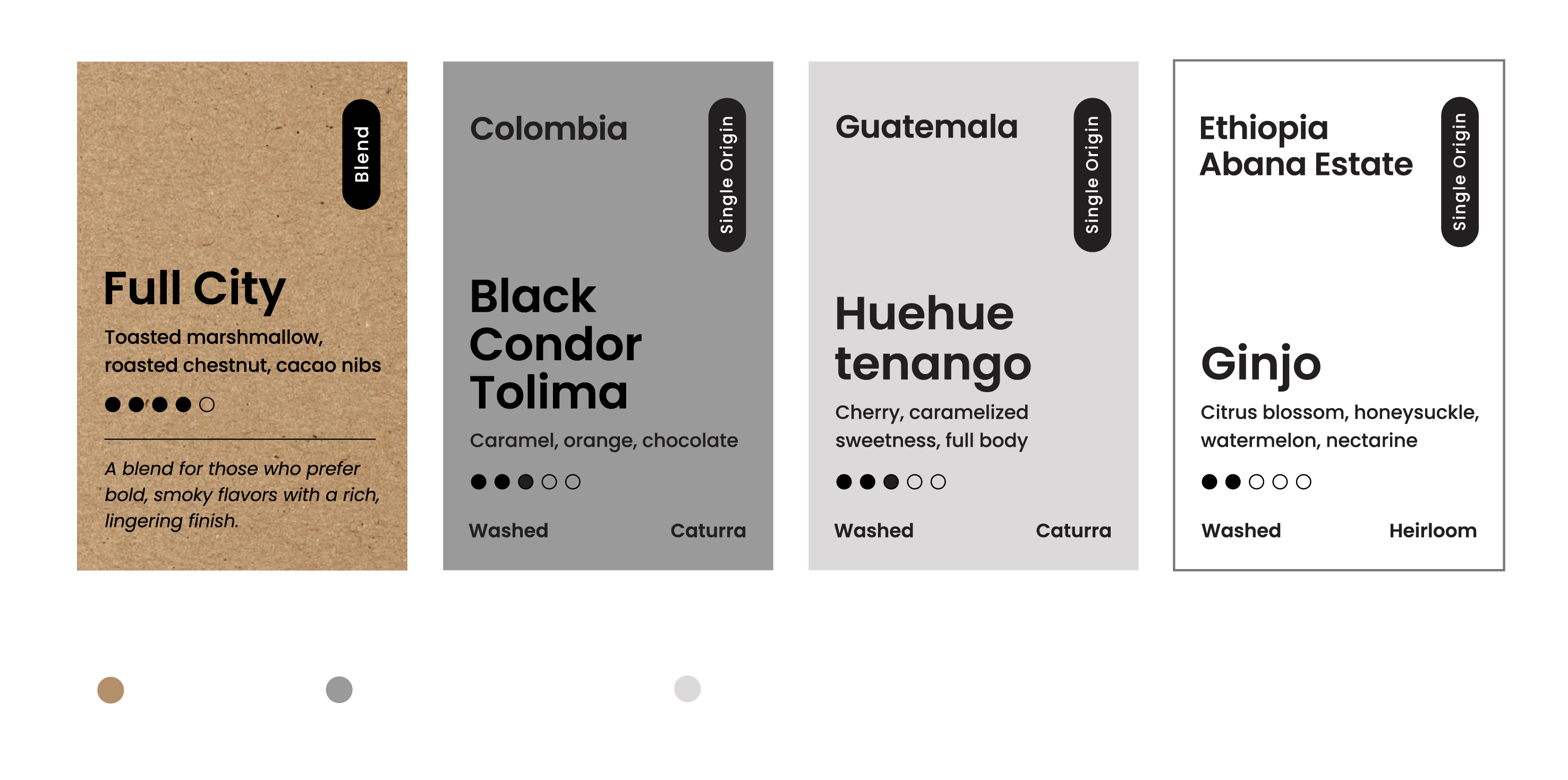
Initial Design Concepts
Final Design Concepts
Final Product
By balancing bold, modern design with thoughtful production considerations, the
result is cohesive, functional, and aligned with Reborn Coffee’s evolving identity.